Sunday, April 14, 2013

Urban Behaviour

Hello! Another work in progress is here. This time it's inspired by the word 'urban'. When I think of urban, I think of graffiti, hip hop and bold design. I chose to incorporate Vanilla Ice into the mix because I've had Ninja Rap stuck in my head for days. Now it's your turn!


And here is a little info on the American rapper also known as Robert Van Winkle:
Robert Matthew Van Winkle (born October 31, 1967), known professionally as Vanilla Ice, is an American rapper. Born in South Dallas, and raised in Texas and South Florida, Van Winkle released his debut album, Hooked, in 1989 on Ichiban Records, before signing a contract with SBK Records, a record label of the EMI Group which released a reformatted version of the album under the title To the Extreme. Van Winkle's single "Ice Ice Baby" was the first hip hop single to top the Billboard charts.


These are some reference images I used. Nice quaff!


Here are my thumbnail sketches:
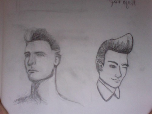
Photo on 2013-04-13 at 17.04

I decided to go with this one:

thumbnailfinal

I started with creating shapes for the hair and head. I added thick and bright strokes to contrast with the pastel fills:
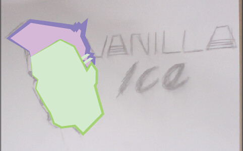
head

I added more detail in the face, creating shapes for shadows and using the colour halftone effect to add some pattern. I did the same to add a lighter chunk to the hair:

face

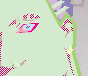
I added in more detail with the eye and ears:
eyes

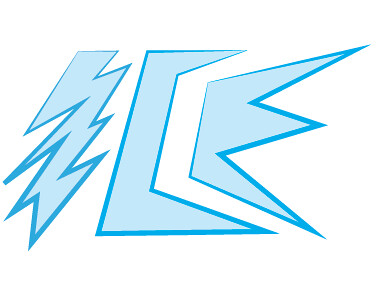
The next step was the text. I decided to go for just 'Ice' instead of the whole name. I created blue shapes with a bolder blue stroke:
ice1

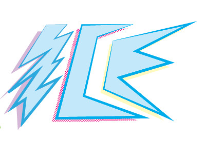
I created a drop shadow effect behind it by copying the letters and changing the colour fill and playing with colour halftone effects again:
ice2

Then I added in green lines to make the text pop out more. This is the final design:

icefinal

And here it is mocked up on a light blue t-shirt!:

urban-tshirtmockup

I'm pretty happy with the overall design. I think I am going to continue with the stylized portraits and see what I can do with them! Until next time! :)

Wednesday, April 10, 2013

Jurassic Times

Hello readers! Another work in progress is here! This time we are going back to the Mesozoic era (sort of) with a Jurassic Park themed design, inspired by the word "egg"! Here is a little back story of the 1993 movie:
Steven Spielberg's phenomenally successful sci-fi adventure thriller is graced by state-of-the-art special effects from the team of Stan Winston, Phil Tippett and Michael Lantieri from George Lucas's Industrial Light & Magic. The film follows two dinosaur experts -- Dr. Alan Grant (Sam Neill) and Dr. Ellie Sattler Laura Dern) -- as they are invited by eccentric millionaire John Hammond (Richard Attenborough) to preview his new amusement park on an island off Costa Rica. By cloning DNA harvested from pre-historic insects, Hammond has been able to create living dinosaurs for his new Jurassic Park, an immense animal preserve housing real brachiosaurs, dilophosaurs, triceratops, velociraptors, and a Tyrannosaur Rex. Accompanied by cynical scientist Ian Malcolm (Jeff Goldblum), who is obsessed with chaos theory, and Hammond's two grandchildren (Ariana Richards and Joseph Mazzello), they are sent on a tour through Hammond's new resort in computer controlled touring cars. But as a tropical storm hits the island, knocking out the power supply, and an unscrupulous employee (Wayne Knight) sabotages the system so that he can smuggle dinosaur embryos out of the park, the dinosaurs start to rage out of control. Grant then has to bring Hammond's grandchildren back to safety as the group is pursued by the gigantic man-eating beasts.


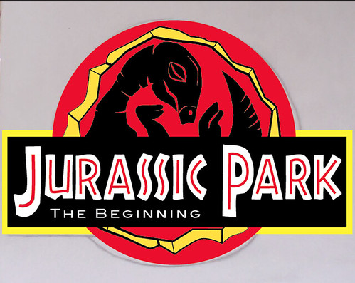
As I was trying to think of a design to mend eggs and Jurassic Park, I decided to revamp the logo from the first movie creating a prequel concept logo, inspired by dinosaur eggs! The prequel movie in my mind would be about before the scientists created the park, and how they came about the idea to clone the dinosaurs. Here is a scene from the movie, as well as some reference images for my inspiration!


Here is the original logo:


And here are some reference images I used:


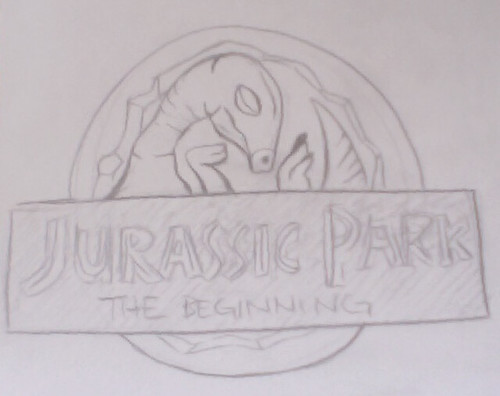
This is my final choice of thumbnail. I wanted to keep the 'silhouette' style of the original logo as well as the same style of text:

thumbnail

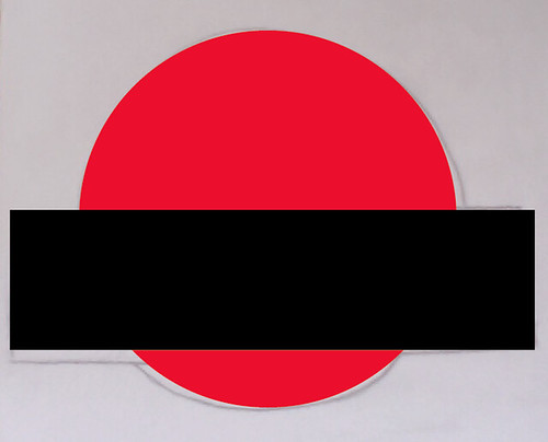
I started out with the base, using the shape tool in Illustrator:

base

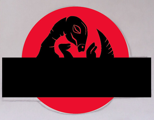
Then I traced the outline of the baby dinosaur, creating a shape with the pen tool. I added red strokes as lines to show the detail in the body and face:

dino

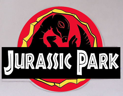
I then added the cracked opening of the egg, creating a yellow shape with black strokes for detail:

eggcrack

I then added in the title text. The typeface is called "African" and I downloaded it for free HERE. The type didn't look exactly like the logo text, so I created outlines of the text and adjusted the shapes with the move tool.

text

Lastly for the design was the subtitle, the red strokes inside the text and the yellow "stroke" on the text block. I actually placed a yellow shape behind the red and black base shapes:

strokes

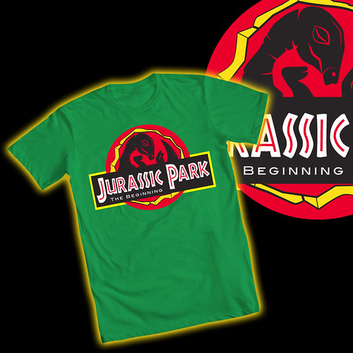
And here it is on a t-shirt mock-up! I wanted to try a coloured shirt this time, and I think the green goes well with the colours of the logo.

egg-tshirtmockup

Keep locked in for more exciting things soon! :)